One
April 2010
By the time forScore 1.0 was released, just six days after the iPad's debut, a lot had already happened. It was crafted blindly for a device few people had actually used, in a category Apple hadn't yet fully defined, destined to be met by an audience of skeptics.
Websites like MacRumors and Gizmodo took notice, giving us the opportunity to give forScore the debut it deserved. Five years and a hundred versions later, it's clear that forScore had the right idea at the right time. Peel away those years of development, however, and it's hard to imagine just how basic it was in the beginning.
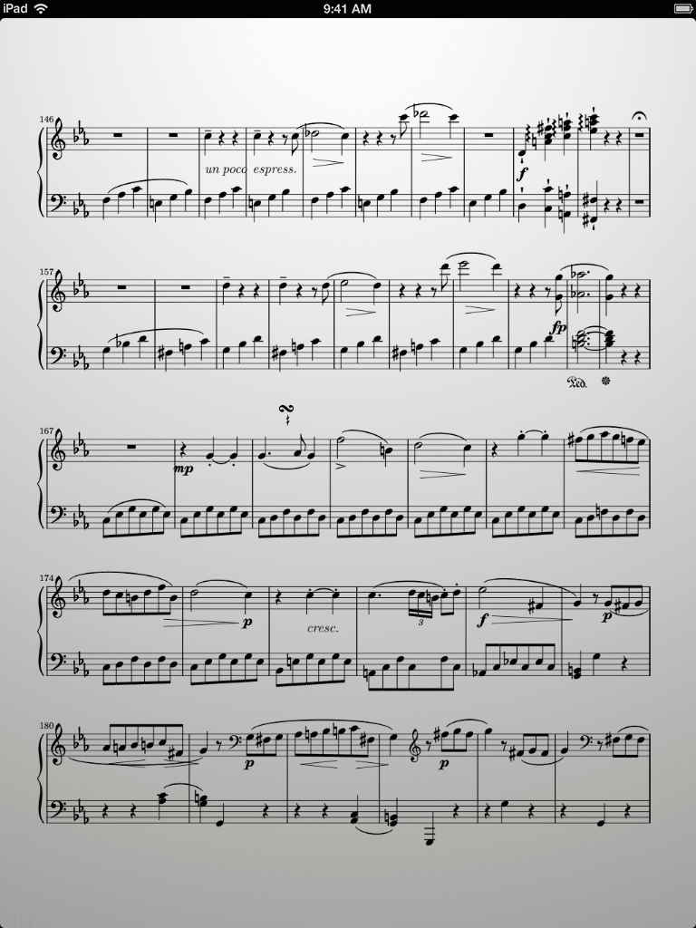
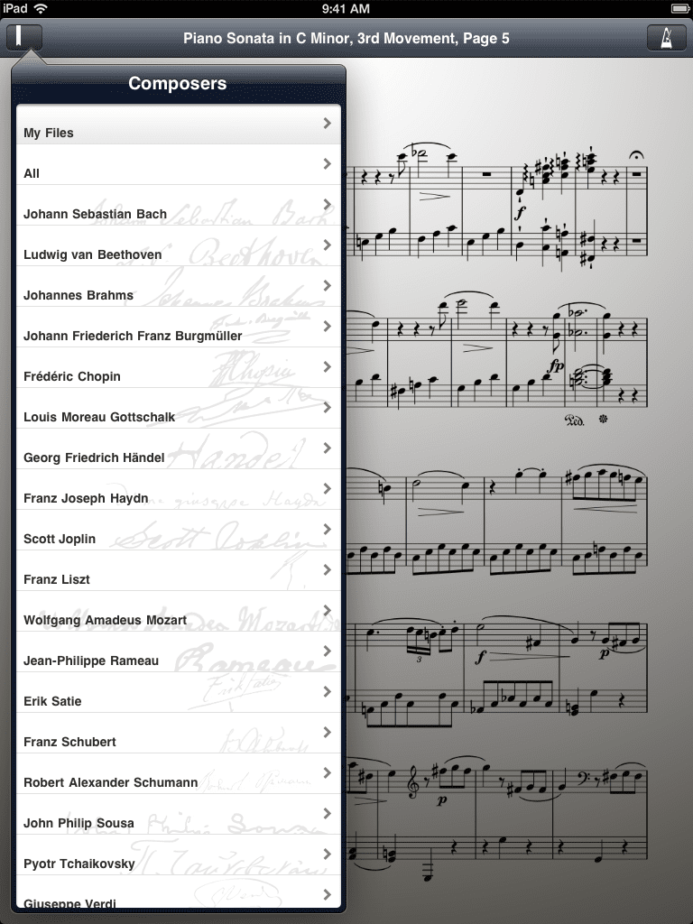
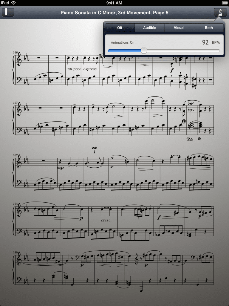
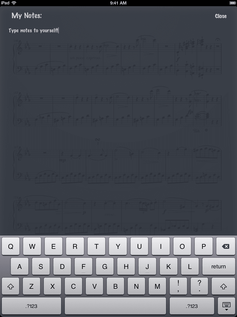
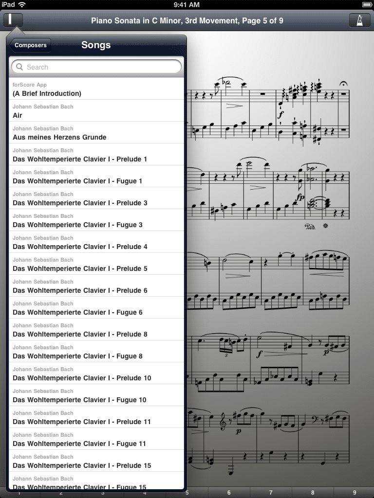
It displayed PDF pages on screen and used a unique layout in landscape orientation to maximize screen real estate (rather than the standard split-screen view that other apps used). It featured a single menu for navigating between the almost 300 bundled scores and any of your own PDFs that you may have added via iTunes. It also featured a metronome with a standard audio mode and an innovative visual mode that remains largely unchanged to this day. A 'notes' feature allowed you to type page-specific notes and recall them later, and that was it.
With versions 1.1 through 1.6, we worked furiously to add the most important and basic features to forScore, features like annotation, zooming, setlists, links, and more. Its evolution from proof of concept to viable tool was swift, with most of these new features coming within just four months of release.
 The bookmark icon in the top left was changed after our first rejection delayed forScore 1.0's debut by a week
 Marker Felt was a completely reasonable design choice at the time
 The new 'skip-to-page' bar along the bottom of the screen in 1.1 allowed quicker navigation (as long as you didn't have more than a dozen pages or so)
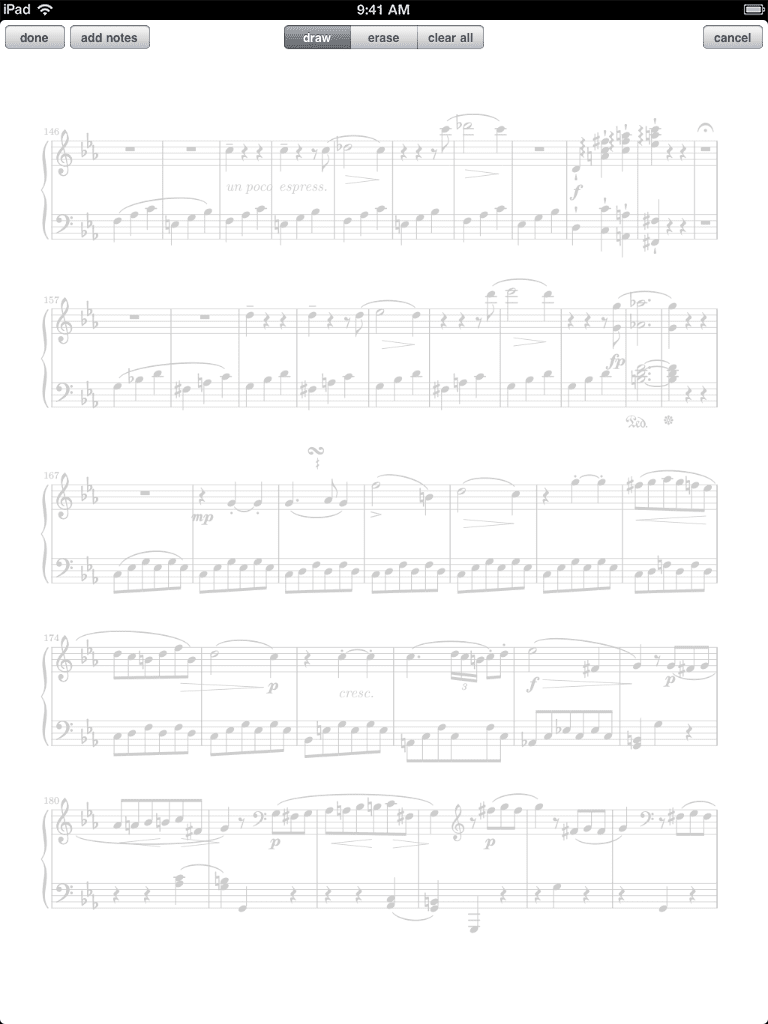 Notes moved to the new annotation screen, which allowed users to draw on the page in red (only)
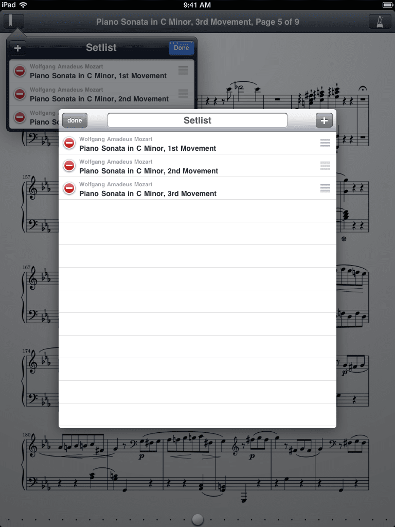 Setlists, a key forScore feature, debuted in 1.2 along with a more flexible skip-to-page bar
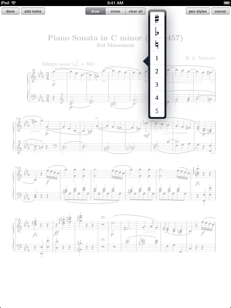
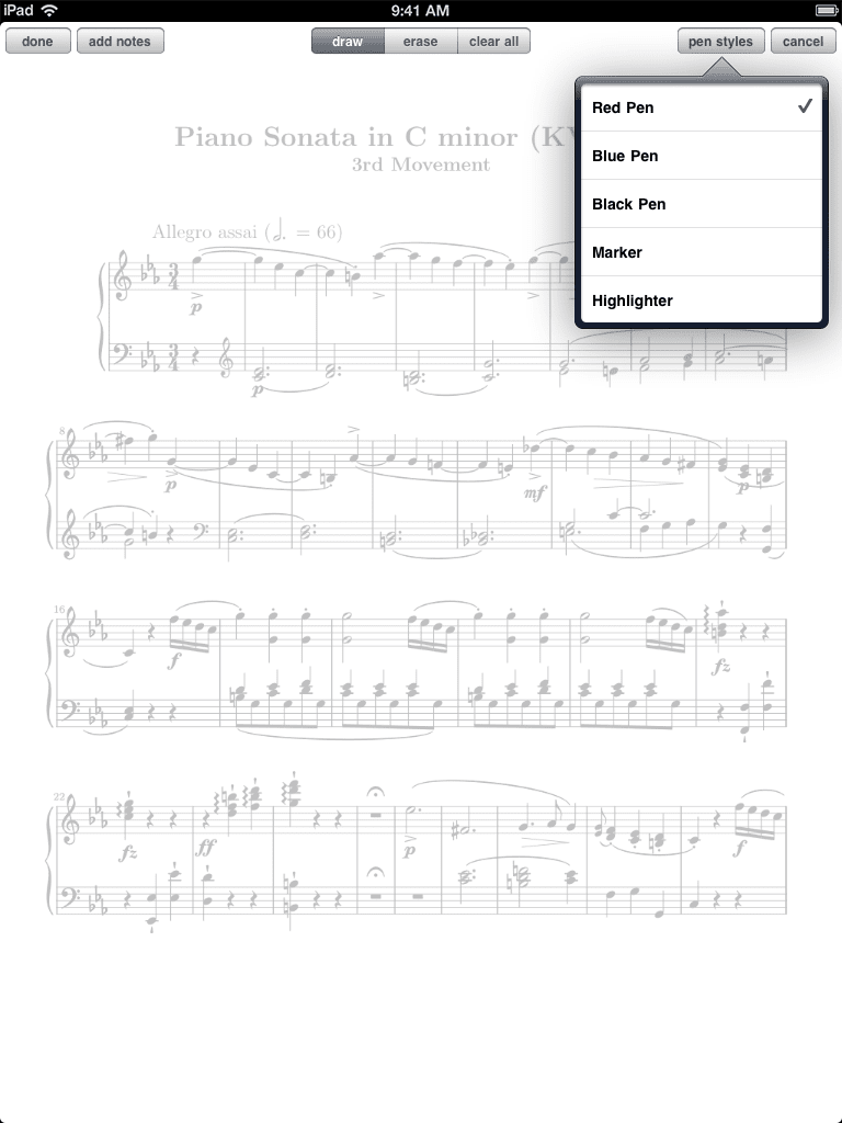 Annotations now featured 'pen styles' (a customer once argued that "Musicians never use pens, and certainly not red ones!")
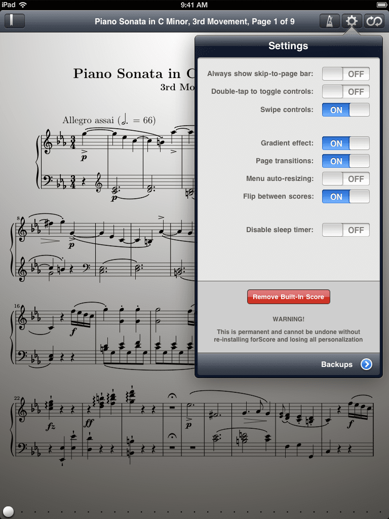
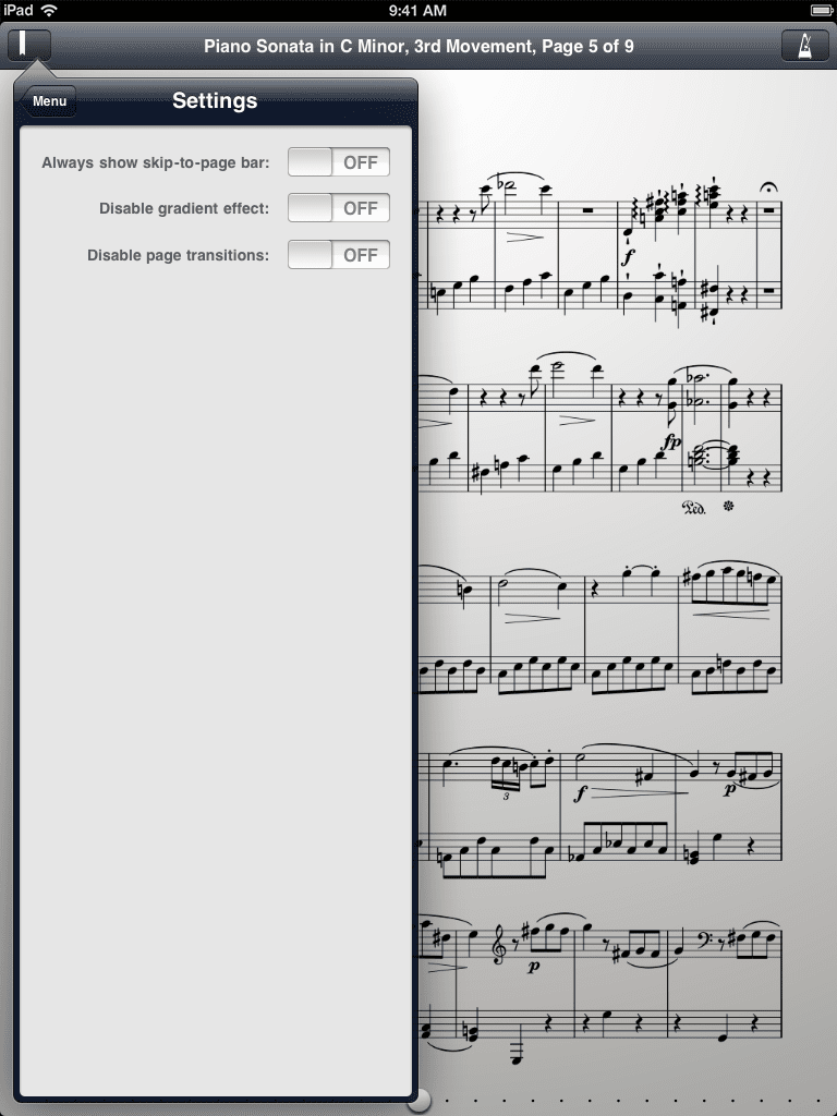 The first incarnation of forScore's settings panel
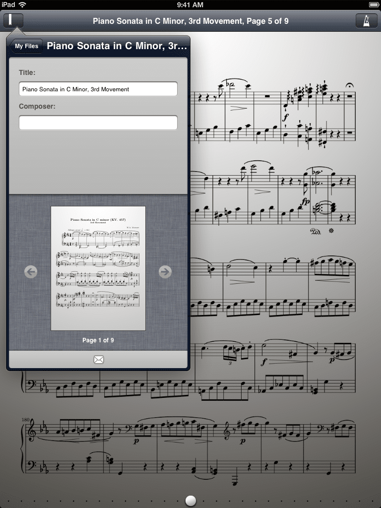 The first metadata panel (oh, that linen)
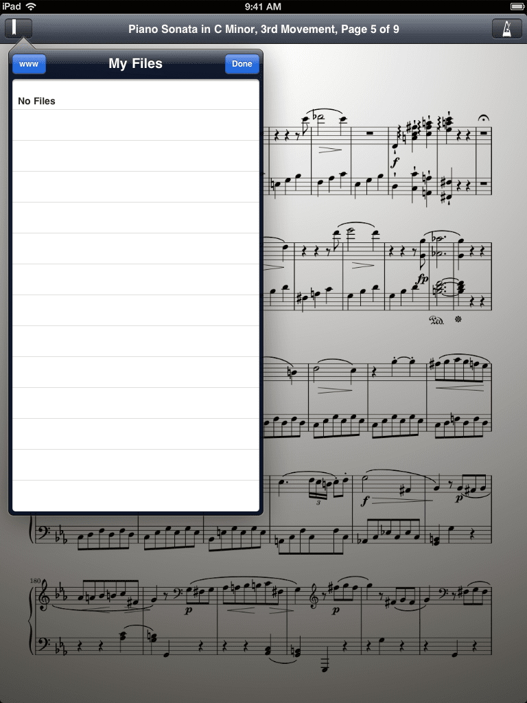 An in-app browser ("www") allowed quick access to virtually anything
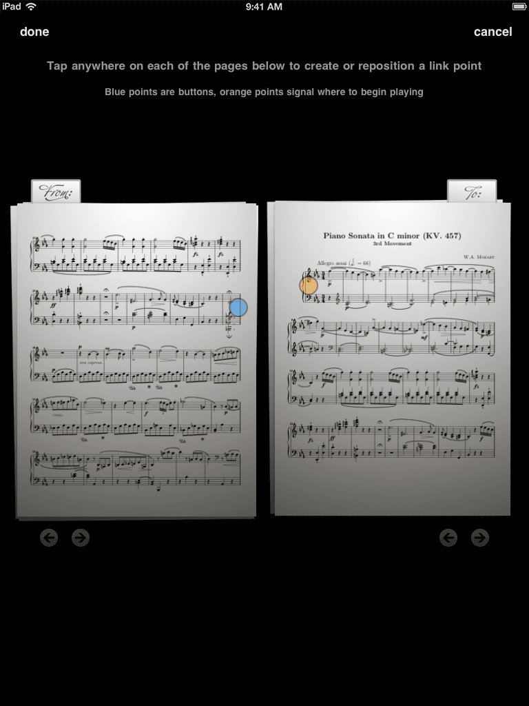 Links, version 1.4, and too much fun with fonts
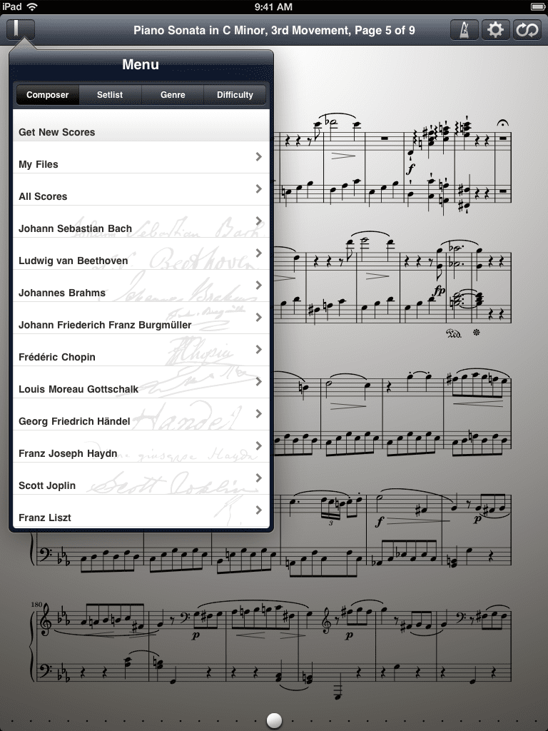 A segmented control in the menu helped establish an organizational hierarchy
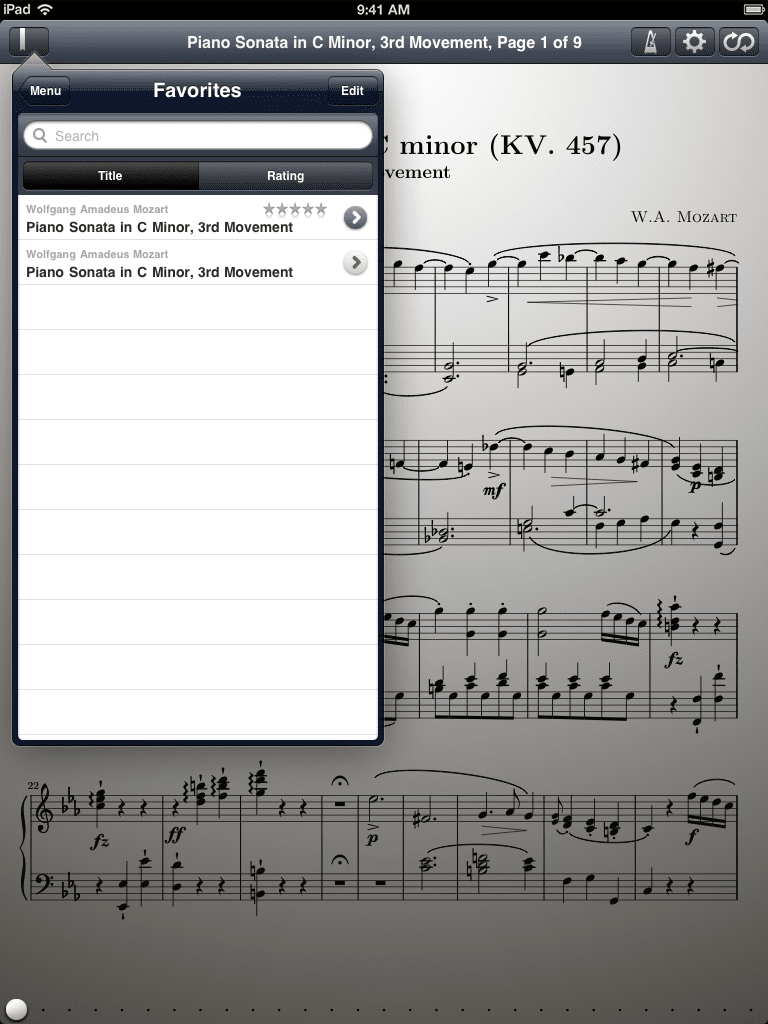 Ratings allowed users to sort scores within submenus
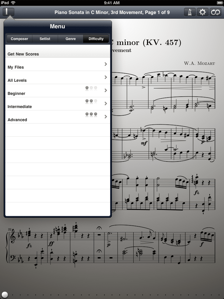 Difficulty would eventually follow suit, but began as a top-level category
 Stamps debuted in 1.5, allowing users to place common symbols on a page
 The settings panel and links feature moved out of the main menu
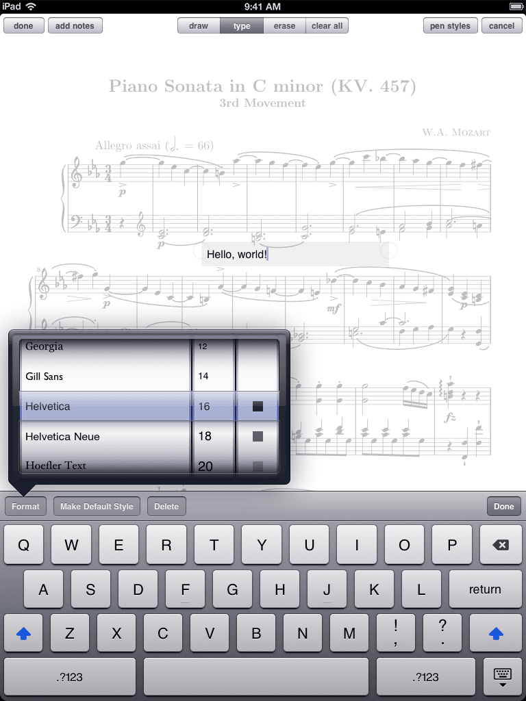 Text annotations joined drawn annotations in 1.6 for a much improved experience